Great site by Corey Ginnivan for testing color contrast under different vision conditions like color blindness, cataracts, and glaucoma, and situational conditions like direct sunlight.
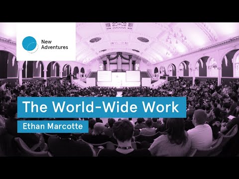
Finally watched Ethan Marcotte’s talk from this year’s New Adventures conference. It’s as good as everyone said.
The sewing machine was introduced to the public in the middle of the 19th century. When it was made commercially available, it was advertised as an appliance that would free women from the routine drudgery of hand-sewing.
A few short decades later, this pamphlet said that a female operator could use a Singer sewing machine to produce 3,300 stitches per minute.
That shift in tone is really intriguing to me: as the technology improved, the messaging around sewing machines shifted from personal liberty to technical efficiency.
People are promised that technology will free them; ultimately, as the technology matures, it captures them.
I’d like to propose that what happened with the sewing machine is currently happening with the Web: that the Web is becoming industrialized in the same way that the sewing machine was.
Eric Bailey posted a terrific list of principles that should be kept in mind when working on web accessibility.
Digital accessibility work is not easy, but it is vital. It is a holistic, multifaceted discipline that touches on multiple interconnected social and technological issues.
The Possibility Gap is a dark pattern that arises when a product takes advantage of unknown unknowns on the part of their users, as it relates to their understanding of what is possible in digital products today.
What we know is that native and custom calendar controls are often a problem for users and applied where they are not needed. Before dropping the code on a screen as a matter of habit, consider if it genuinely helps the user or just your workflow.
An open-source community effort to map support for web accessibility features across different Assistive Technologies. It’s still early days, but I hope this flourishes — accessibility interop is a complex topic in dire need of de-mystification.
One thing that is often forgotten about accessibility is that keeping things simple and utilising semantic HTML gets you most of the way towards providing a fully accessible experience for everyone.
There are a few CSS techniques for hiding content visually while keeping it accessible to screen readers, but none of them are perfect — and in some cases may even be harmful.
@zellwk has put together a great round-up of the issues.
UPDATE! This approach has bugs. Best solution so far is by @_josephwatkins.
It could seem like an enticing option for our users, at first glance: an enhanced, fully-featured website, on the one hand, a fully accessible alternative experience on the other. That unravels with even the slightest examination, though: if the fully-featured website isn’t accessible, the accessible website won’t be fully featured. By choosing to have the “accessible experience” deviate from the “real website,” we end up drawing a sharper line between those two definitions, and we nudge the “accessible experience” closer to an afterthought—limited and frustratingly out-of-sync with the “real” website, like so many dedicated mobile sites quickly became.
There’s a widespread movement in design circles to reduce the contrast between text and background, making type harder to read. Apple is guilty. Google is, too. So is Twitter.
My plea to designers and software engineers: Ignore the fads and go back to the typographic principles of print — keep your type black, and vary weight and font instead of grayness. You’ll be making things better for people who read on smaller, dimmer screens, even if their eyes aren’t aging like mine. It may not be trendy, but it’s time to consider who is being left out by the web’s aesthetic.
A deep dive into figure accessibility from Scott O’Hara:
A figcaption is meant to provide a caption or summary to a figure, relating it back to the document the figure is contained within, or conveying additional information that may not be directly apparent from reviewing the figure itself.
If an image is given an empty alt, then the figcaption is in effect describing nothing. And that doesn’t make much sense, does it?
Many people I meet think title texts, also known as tooltips, improve both the accessibility and usability of their sites. They don’t. In fact, they can even cause problems.