In defense of an old pixel
youtube.com
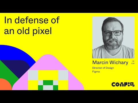
Wonderful talk about pixel fonts by Marcin Wichary.
Wonderful talk about pixel fonts by Marcin Wichary.
Josh Comeau:
In this tutorial, we’ll learn how to transform typical box-shadows into beautiful, life-like ones.
Elise Blanchard:
To truly understand the origin and evolution of hyperlinks though, I took a journey through technology history and interfaces to explore how links were handled before color monitors, and how interfaces and hyperlinks rapidly evolved once color became an option.
George Cave:
Piloting an ocean exploration ship or Martian research shuttle is serious business. Let’s hope the control panel is up to scratch. Two studs wide and angled at 45°, the ubiquitous “2x2 decorated slope” is a LEGO minifigure’s interface to the world.
These iconic, low-resolution designs are the perfect tool to learn the basics of physical interface design. Armed with 52 different bricks, let’s see what they can teach us about the design, layout and organisation of complex interfaces.
Welcome to the world of LEGO UX design.
Frank Chimero writes about the design process for the header navigation on his personal site:
You’d imagine that a seasoned and soured designer would side-step all of these complications whenever they could. And indeed, most do. Visit many designers’ websites and you will see two links in the navigation: Work and Info. Bully for them. I am, on the other hand, an unsympathetic and frustrated creative. I have a sprawling empire of conflicted uselessness locked into the coordinates of www dot frankchimero dot com. Welcome to my personal website, my empire of shit.
Oh how I understand Frank’s plight.
Chris O’Falt interviews Bong Joon Ho and production designer Lee Ha Jun about Parasite’s brilliant set design:
According to Bong, the challenge he gave his “Snowpiercer” production designer was not only to create a believably “visually beautiful” set, but a stage that served the precise needs of his camera, compositions, and characters, while embodying his film’s rich themes. In an interview with IndieWire, Bong described the home as “its own universe inside this film.” He added that he took pleasure in hearing that the famous directors on this year’s Cannes jury — which included Alejandro Gonzalez Iñarritu, Yorgos Lanthimos, and Kelly Reichardt — were all convinced that the movie took place in a real home. In truth, Bong asked his production designer to create an “open set,” built on an outdoor lot.
Great site by Corey Ginnivan for testing color contrast under different vision conditions like color blindness, cataracts, and glaucoma, and situational conditions like direct sunlight.
John Gruber spent some time with the new MacBook Pro:
It feels a bit silly to be excited about a classic arrow key layout, a hardware Escape key, and key switches that function reliably and feel good when you type with them, but that’s where we are. The risk of being a Mac user is that we’re captive to a single company’s whims.
Great that they fixed the keyboards, but I’m guessing repairability hasn’t improved. My 2014 MacBook Pro’s battery started expanding recently, and I was surprised to learn that a battery replacement isn’t a simple job, even for this older generation. The battery is glued in place, so replacing it means an entirely new top case, keyboard, and trackpad — and in my case a week without my computer. That’s bad design too, and a side of it that Apple isn’t getting enough flak for.
Jeremy Keith:
Jason shared some thoughts on designing progressive web apps. One of the things he’s pondering is how much you should try make your web-based offering look and feel like a native app.
This was prompted by an article by Owen Campbell-Moore over on Ev’s blog called Designing Great UIs for Progressive Web Apps. He begins with this advice:
Start by forgetting everything you know about conventional web design, and instead imagine you’re actually designing a native app.
This makes me squirm. I mean, I’m all for borrowing good ideas from other media—native apps, TV, print—but I don’t think that inspiration should mean imitation. For me, that always results in an interface that sits in a kind of uncanny valley of being almost—but not quite—like the thing it’s imitating.
People have been gleefully passing around the statistic that the average number of native apps installed per month is zero. So how exactly will we measure the success of progressive web apps against native apps …when the average number of progressive web apps installed per month is zero?
Marcy Sutton is collecting good examples of websites and interfaces where accessibility and beautiful design go hand-in-hand. Subscribed.
Terence Eden explains how different screen technologies, human biology, and fingerprint grease make “pixel perfection” a pointless goal:
There is no grid. There never has been. You can align to theoretical pixels - but as soon as the image hits a physical screen, it will be adjusted to best fit reality.
An obsession with pixel perfect rendering is futile.
Every Layout expands on this idea, specifically as it pertains to CSS:
Suffice it to say that, while screens are indeed made up of pixels, pixels are not regular, immutable, or constant. A
400pxbox viewed by a user browsing zoomed in is simply not400pxin CSS pixels. It may not have been400pxin device pixels even before they activated zoom.
See also: Ian Mallett’s Subpixel Zoo: A Catalog of Subpixel Geometry.
Ollie Williams welcomes the new CSS properties for styling underlines:
Finally we can demarcate links without sacrificing style thanks to two new CSS properties.
text-underline-offsetcontrols the position of the underline.text-decoration-thicknesscontrols the thickness of underlines, as well as overlines, and line-throughs.
I’ve been working on a blog post about this topic, and Ollie does a good job of covering some of the points I want to make. But I want to go further and explore implementation quirks, the details where the new properties don’t quite go far enough, and make a case for why underlines shouldn’t be pixel-aligned.
PC Gamer’s Steven T. Wright interviews Lucas Pope on the process of creating Return of the Obra Dinn:
“When you’re developing a game as one person, you have a lot of advantages and a lot of disadvantages,” he says. “One of the advantages is that you can afford to make a game for two years without even really knowing what it is, which is exactly what I did. One of the disadvantages is that you have to do something different visually to stand out. This means I have to solve all sorts of problems that nobody else has solved, at least recently. But I think that can be fun in its own right.”
The game’s development seems to have been more of a process of discovery and improvisation than one of decisive creativity. That explains a lot.
Chris Coyier’s latest talk puts all the complexity of modern front-end development in perspective:
All the very huge responsibilities front-end developers already have:
- Pulling of the design
- Making the design part of a system
- Making sure it is accessible
- Worrying about the performance
- Testing things across browsers
- Testing things across devices
- Sweating the UX
Oh hello, big pile of new responsibilities
- Component-driven design, designing our own abstractions
- Site-level architecture
- Routing
- Fetching our own data
- Talking to APIs
- Mutating data
- State management
Oof.
Kyle Wiens makes a great point:
[Dieter] Rams loves durable products that are environmentally friendly. That’s one of his 10 principles for good design: “Design makes an important contribution to the preservation of the environment.” But Ive has never publicly discussed the dissonance between his inspiration and Apple’s disposable, glued-together products.
When a single broken key requires replacing a laptop’s entire top case, there is no denying that Apple has given too little consideration to the durability of its products.
I’m extremely curious to find out how (if?) Apple’s design philosophy will change with Ive gone.
Great interview. Frank Chimero is always thought-provoking:
Everyone has their lean years, but I think they make a poor compass. You can always work more. We need to disabuse ourselves of the thought that work is the solution to our problems, or that by keeping up we are getting closer to something worth having. Being more active is not being freer. I won’t romanticise those months on peanut butter and jelly as freedom, but I can confidently say that in retrospect the problems of that time were no better or worse than the ones I’ve experienced at the peak of my successes.